Editor’s Note: As with anything that I’ve written on this blog, I give Wizards of the Coast full use of these ideas and I won’t get mad. I mean, I suggested Memnite to see print at the same time Scars of Mirrodin was being designed. We’re cool Wizards, just send over some lawyers if you want me to sign some stuff if it makes you feel better (fist bump).
When I was flying down to Texas for the Magic Cruise 3, I had a few hours on the plane with no internet and a wife that was enthralled in Suduko (I have cards, she has numbers). Out came my paper notebook that I brought with me just in case I had some ideas for card design. Who am I kidding, I always have ideas for cards (and if you’ve got the same fever, you know what I’m talking about). My mind wondered to my GDS2 world that I half-heartly designed. It had been gestating in my mind for a while wondering if I should continue to work on it for fun. My pen connected with paper and out expressed all these ideas that I wish I had thought of the first time.
Time away from a project does bring focus.
Suddenly, I was coming across story and world ideas that I didn’t consider in the first place which would’ve made the whole thing (personally) much more interesting. If only I had thought of them in the first place…
Let’s not dwell on the past.
Anyway, besides the awesomeness of the story/world I was cooking up, I wanted to see if I could complete the cycle I was working on. You might remember it:
 While I mainly focus on real world design instead of player created ones, I’m going to be a little egotistical here and show my process it about this cycle. For those that like to design their own cards in a serious manner, hopefully this will shed some light into what I was thinking. This is not a “You have to do it this way,” but just how my mind came up with this. After revisiting the world, I wanted to see if it could be done.
But before I create the future, I had to revisit the past.
I already talked about Infuse here, but let me talk about why I keep gravitating to “Colorless Hybrid” cards like the one above. Colorless spells are not a new concept with amateur designers. In fact, anything that hasn’t been printed will be created by these people. That’s why you’ll see such wacky things as Enchantments that can tap and Artifact Instants. If you’re messing around for fun, that’s one thing, but it won’t fly if you want to design stuff that might actually happen. And once WotC actually prints one of those off the wall ideas, it only opens the flood gates for more designs like that.
I keep calling it colorless hybrid is because the concept first started out with something like this:
Colorless Elf – [2/G]
Common
Creature – Elf Shaman
T: Add 1 to your mana pool.
1/1
Since I love dealing with the color pie (Oh, that’s where my name comes from), I wanted to do a block where I thought it might be interesting if we played around with a colorless concept. The original idea for the world was one where it was so desolate for colored mana that half of the creatures have adapted to life without it. Sure, they were “better” if they used the appropriate mana in the first place but it was all about survival. I wanted to create a work kinda like the one in the anime Trigun (one of the only anime’s I’ve seen all the way through), but it ended up being different.
Anyway, It’s not like this was the first time that this card concept has been used before:
 My idea was an extension of that, but different in two important ways:
- The Shadowmoor mono-color hybrids were all Instants or Sorceries, no permanents
- The card frame was still mono-colored
We’ll get to part 1 in a minute. Yes, Colorless Elf is Green and only Green, but I wanted to show that you could pay for it colorlessly easier than just looking at the mana symbols in the upper right hand corner. When you’re flipping through your cards at high speed the best way to identify the color(s) of a card is through its card frame. Even with Gold cards (which are multi-color), the borders around the art and text boxes show which colors it belongs to.
While it’s hard to miss three mana symbols in the upper right of the card, if you’re not fully paying attention or going through too fast [2/G] can seem like 2G, which makes a huge difference. By having the frame split colorless/colored, it could be shown that these cards are different and require to be paid attention to a little bit more. Plus, I think they’re really cool, but I’m sure the Art department would want to shoot me and that would be an uphill battle on its own (something I couldn’t talk about in the few words I was given to write about the cards).
Now the first part of the differences is equally as important as it effects card design rather than just pretty art. Designing “colorless” permanents are much different than designing “coloreless” spells. It’s like designing artifacts; if they have the possibility to be used in every color, it’s got to be designed with that in mind. Take a look at Wurmcoil Engine; if you’re not comfortable having a 6/6 lifelink, deathtouch, makes 2 3/3 tokes when it dies in every deck and color, then watch what you’re designing.
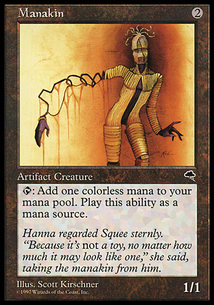
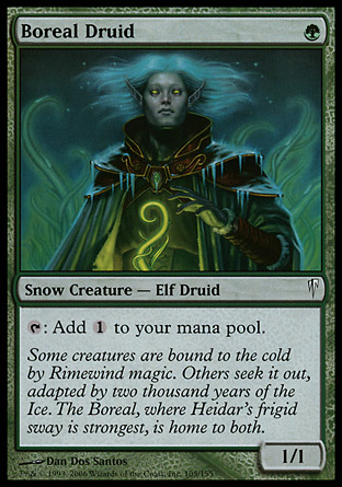
If we take a look back at Colorless Elf, we see that (I’m not being modest), it’s a great start for this colorless hybrid experiment. First, it’s a simple concept which is important because we can see how it fits. You don’t want to do anything too complicated when working on a new design; simple is better. The core concept of what you’re trying to do comes across much easier. Plus, this card doesn’t bend the color pie too much. Why do I say that? Well, because of this:


Yes, Colorless Elf is both of these mashed together (minus the artifact and snow designations). If you wanted to, you could make the mana that the elf creates Green (which might fit into the world), but I would feel that would be a development issue and something you could include on the multiverse comments (more on this later).
Here was a completely grokkable idea that seemed like it could open up new design space. But I was designing for GDS2, where we couldn’t have any art, and only so many words to talk about our work. So, I could talk about the frame (which I believe was the best selling point) which would eat up too many words. The other strike against it was that I was trying to create a world, and this couldn’t be just a one shot. After creating a couple of “simple” creatures I was getting the feeling that this was going to take much more work than what we had allowed.
The Shadowmoor 5 taught us a few lessons:
- One colored mana should equal two colorless ([2/G] as an example). While this isn’t a straight import and should be used on every card ever, it’s a guideline for creating these types of hybrid cards.
- The effect should be a discount for the main color. All of the effects were mostly out of place for the other colors, but it fit in the world that if you could cast a spell for 6, you could cast these.
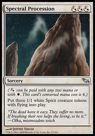
- The more colored mana you have, the more it is of that color. Doing 4 damage for RRR seems fair, and it’s completely Red. Creating 3 1/1 flying tokens for WWW seems fair, and it’s White (Three Suntail Hawks).
I still feel that this is a great idea, but we (the awesome players who worked with me on the wiki) didn’t have the time to dabble in this. We can explore color theory all night (and boy do I love that), but I don’t think that we could’ve come up with something to sustain for multiple rounds. Looking back, I do think it was the right choice that I dropped it.
With the combination of Infuse being suggested, I thought of a cycle of cards I loved to shove into design which reminded of that keyword. I created this right after Shadowmoor:

Rage – [R/G][R/G]
Uncommon
Instant
For each R spent to cast Rage, target creature gets +1/-1 and first strike until end of turn.
For each G spent to cast Rage, target creature gets +1/+1 and trample until end of turn.
Looking back, I guess I had stumbled upon Infuse before (which explains why I was so drawn to it). This card is different from the colorless hybrid ones because you have to have either Red or Green mana to cast it. It can kill a creature if you wish (Thanks Immolation!), or pull that win out of no where with giving a creature +2/+0, first strike and trample (by paying RG). The fact that you can pick and choose your modes makes this a fascinating cycle to design.
While this doesn’t fit into the Timmy demo, this card concept (I believe) hits a home run with Spikes and Johnnies. They love options, and being able to create cards advantage with “casting two spells with one card” allows for more controlled gameplay. Varying mana to control the outcome of the spell can be very powerful and appealing.
It was with the colorless hybrid creatures on my mind, and looking at the recent Rise of the Eldrazi expansion that I thought of trying to combine the two ideas. With colorless spells finally being printed, it was time to see if it could work in this world where mana was malleable? If the creatures could adapt to the lack of colored mana, could the spells as well? Could I create a true colorless spell that allows me to vary the mana costs like with the hybrid spell to create a unique card that would catch the attention of the GDS2 judges?
 I believed that it was important to get one card that would make the judges go, “Wow.” I don’t know if it did the trick (as clearly that card didn’t put me in the Top 8), but everyone I showed Brilliant Charge to loved it. It was something different, unique, and hopefully thought provoking. But the trick with a card like this (and almost any design really) is to work out all the details. MaRo has a great story about that here (search for #8), but it’s what ties the card in together. Brilliant Charge has three parts that need to be focused on:
- The colorless effect
- The colored Infuse parts
- Fitting them together
Each of these things tie into each other. For this to get the desired response from the players/judges, all three pieces have to make sense.
The colorless effect
Since each spell (in a cycle of five) was going to be a “combination” of two different colors, the effect of the colorless spell would be something that both colors could do. Taking a look at Brilliant Charge, the colorless effect is: Creatures you control get +1/+1 until end of turn. It’s been seen plenty of times in White, but don’t discount it in Green (Overrun would like to say hi).
Each of the other cards in the cycle would fit the same pattern: have an effect that both colors would have access to. I chose 3 as the casting cost because it would give the designer a little wiggle room with the colorless effects and creating an interesting tension with the next part.
The colored Infuse parts
Obviously you know what comes next: insert the colored Infuse parts. The trick with Infuse is that because it’s scalable, you have to find effects that you can be happy with seeing repeated. Not only being repeated, but having them basically cost 1 mana.
That’s the huge issue.
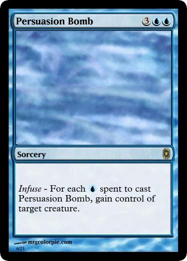
 I submitted a card that was a Control Magic, but with Infuse. I wanted to create a power flashy rare with Infuse for MaRo to preview (if you don’t remember you were supposed to submit cards for the dailymtg.com team to preview during preview week). This was too much though. You don’t get to steal creatures for a single U mana, so why would you be able to steal five for UUUUU?
Just because a spell has colorless in its mana cost doesn’t mean that players aren’t going to pay colorless for it. That’s what I forgot when I designed this card.
Every effect that you create for Infuse has to only be around 1 mana (it can be a little more or a little less). Giving a creature trample or vigilance can be seen as around 1 mana (referencing Brilliant Charge), stealing a creature isn’t. If I was going actually make a set and create cards with Infuse, I would make a list of all the effects in all of the colors that I would be happy with for around 1 mana. Of course, it’s going to scale between the rarities (where I was going with Persuasion Bomb), but I wasn’t just going to have a card that said: “BBB: Target player Discards 3 cards.”
I would just like to point out here that nothing is written in stone at this point. If this was a real design team there would also be a development team as well. I could throw out a million possibilities and suggestions and it would be up to the development team to make sure that it would play and feel alright (and check with the rules team to make sure that Infuse does what I hope it’s supposed to do). Maybe Brilliant Charge wants something more than Vigilance, but Lifelink instead. But what I am merely suggesting here would be the design file that I would give to Development.
Fitting them together
Now that we’ve got our main colorless effect and our Infuse parts, let’s make sure they fit together nicely. Why? Because it makes the card feel complete. It wouldn’t make sense for the card to give all your creatures +1/+1 and the Green Infuse made you go tutor up land and White Infuse gained you life. That card is wacky and all over the place. Instead, with the +1/+1 effect, I made your creatures care about power and toughness; Green gave Trample and White gave Vigilance (again, Lifelink might be the better choice here). Why Vigilance? Because if you’re giving creatures +1/+1 as a sorcery, most likely you’re going to attack with them, and a good offense is a good defense.
You might be wondering, “Which part do you design first?” Or not, I’m not a mind reader. It’s the classic chicken and the egg scenario; but for you it’s whatever feels natural. Sometimes you get the colorless part first and base the Infuse sections on it or other times you get the Infuse sections first. Yes, you’ll juggle them around until you find what fits comfortably.
Then you playtest it.
Looking back at all of this, it looks like a ton of work for what’s turning out to be a cycle of five cards. No, you can’t design everything like this, but I believe that this is some of the work that WotC does behind the scenes. They just don’t pick up a handful of pasta to throw against a wall to see if it sticks; they take a truckload of pasta and start shoveling it against that wall. If something sticks, they see what else they can do with it. Yes, this is a massive amount of work for cards that may or not may make the cut for a final set. But look at all the research and creation I’ve done for the future if I want to explore this again. Because I already dabbled around with an early Infuse, I was able to make that grow and branch out.
By using my past experiences and knowledge, I was able to create something new. Without exploring, I wasn’t able to innovate. But, one can only create so many things. As you’ll come to learn in a future post, everything is a remix.
There are a few of you wondering if I actually did create new colorless hybrid cards like what I set out to do (Hey, if you’ve read this far, I guess you should know the answer). Yes, yes I did; I was able to get back into the rules and ideas I set up and create cards of the allied color combinations.
And then I created more.
I needed to see how far this concept can get me. Can I get this to work in enemy colors as well? How far can I stretch Infuse before I’m comfortable with it? Is this a full block mechanic or does this only support a single set? I’ve come up with some interesting ideas and if I’m looking to actually create the world I was discussing, I need every single one.
If you want to see more like this (or hate this), please let me know. On twitter (@mtgcolorpie), on the comments here or through my e-mail (mtgcolorpie_@_gmail). You can also vote with the stars as well as it’s completely anonymous. Next time, we explore more about what the new kingdom will have. Until then, never stop creating.

Interesting that you say the colourless effect should be “something both colours can get”. Of course, you mean “something all five colours can get but that’s most in flavour for both colours”, right? Gauntlet of Might, Bad Moon, and Sunken City show that occasionally the other colours can get a global +1/+1, so that effect fits. But I’ll be interested to see what you achieve for the other four colour-pairs.
Out of interest, where are you storing your cardset under design? If you happen to want to make parts of it public and gather comments from the world, may I offer the services of http://multiverse.heroku.com/, a Multiverse database for the rest of us? Multiverse will also let you generate and edit set skeletons, import and export from CSV, and a bunch of other features like generating boosters from your set. You can make the set private if you don’t want to let people see it – you could use it just to track todo items for cards and for the organisational power of the skeleton handling.
Anyway, just an offer. If you have no desire to put the rest of your designs online, that is of course fine as well!
I’ve been thinking about what your other colourless effects could be. For blue-black, “Draw 2 cards” would probably work – there’s Pursuit of Knowledge, Harmonize, and… er… Mindmoil? Black-red could get “Deal 2 damage” – after all, Flame Javelin and Moonglove Extract show that’s okay for all colours at 3-mana-for-2-damage. Blue-white could have some kind of granting flying, though that feels bad for green, or perhaps “The next spell you cast this turn may be cast as though it has flash”? Red-green is quite problematic. +2/+0 fits in every colour but blue.
Too bad the Charge doesn’t work because you choose targets before paying the cost and you don’t know how much mana you will pay (and what colour) when you’re choosing the targets.